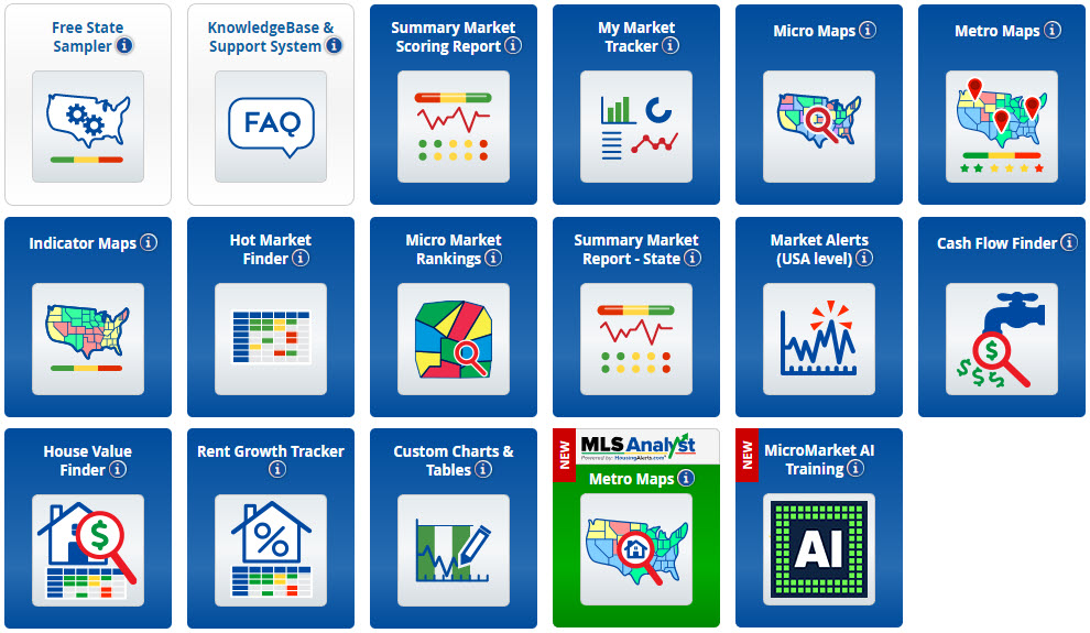
We have a large array of Map Tools offered. Each group of Maps has their own specific data sets and features. You may see more Maps and features added as we continue to grow our systems.
Our various Maps cover data beginning at the “State” level and many even work their way down to the granular “Neighborhood” level.
Locating our Map Tools
To find any of our Map Tools, simply click on the Maps tab on the menu bar, and select the desired Map Tool from the drop-down list.

Or, you can locate them among your the Dashboard tiles:

Using the Map Tools

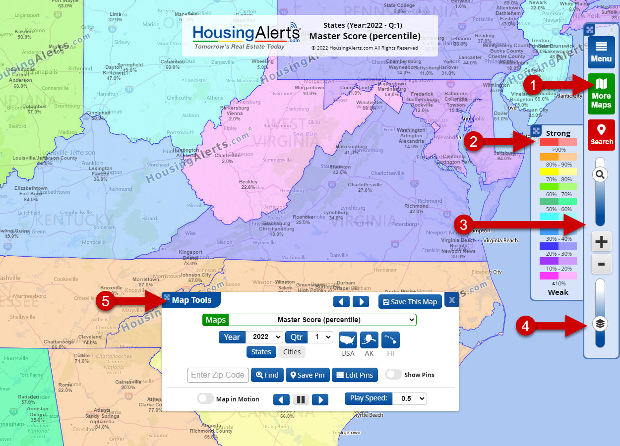
Once you have accessed the chosen Map Tools you will see an array of toolbars and options to search and refine your viewed results.
- Click “More Maps” in the upper right corner to open the Map toolbox.
- The “Legend/Key” will tell you the color and score ranges.
- You can use the slider/buttons to “Zoom” in/out, as well as using your mouse scroll wheel.
- You can adjust the “Overlay” opacity to view the street/map or the color/scores more or less.
- The “Map Tools” allows you to choose your indicator, time-frame, dates, etc… to view the data you need.
Please note that each Map Tools has its own set of options and may have features unique to its data set. These items may include:
- Option to “Save” a chosen map for easy access from your “My Market Tracker” page later.
- Selection of a specific Map Types, Indicator, or Scores (Raw or Percentile).
- Selection of Market Type: State, Cities(MSA), Counties, Zip Codes, or Neighborhoods.
- Automatic centering on the USA, Alaska, or Hawaii.
- Selection of Data Time Frame: Years, Quarters, or even Months.
- Search for specific zip codes, plus Save, Hide, and Manage your Pins.
- Map in Motion animation tools to playback the past Years/Quarters/Months of data.
What do all the Numbers and Colors mean?
The Numbers:
Most indicators will have a “RAW” and a “PCT” (Percentile) score offered.
- RAW Score ranges from 0 (weakest) to 99 (strongest) and measures the absolute performance.
- PERCENTILE RANKINGS are expressed as a score from ‘0′ (weakest) to ‘99′ (strongest), for that specific indicator, and measures relative performance between markets.
The Colors:
Our Heat Maps make use of a nice color spectrum to give you a clean visual assessment of our data.

Each Indicator will have their own Score/Scale and titles, but the rule of thumb in Maps is basically the same overall:
- Higher Scores (towards RED colors) indicate the stronger/rising markets.
- Lower Scores (towards Pink colors) indicate weaker/declining markets.
Before you get started…
Micro vs Macro Markets
An individual zip code or neighborhood is NOT a market. They are sub-markets (micro markets), and STRONGLY trend along the same lines as their ‘parent’ or city-level market.
While there can be strong and weak sub-markets WITHIN a particular city, you should ALWAYS start your search in this order:
- Locate a strong Macro (City-level) Market.
- Then (and only then) drill down INSIDE that market for relatively stronger micro markets.
You should NOT START at the micro market level. (unless of course you have intentionally limited yourself to a single city-level market).
Generally, you will get dramatically better results in a stronger CITY level market (even if the micro market is mediocre) than investing in a weak city-level market (even if the micro market is red hot).
In a hot macro market, a rising tide lifts all boats.
In a weak macro market, sub-markets can rarely go against the tide for any sustained period and eventually perform in line with its parent market.
Interpreting Micro Market Insufficient Data
As you decrease a market’s geographic size (for ex, from City to Zip Code level) you get fewer house sale transactions in a given time period. Statistically speaking, you need a minimum of 25 transactions to get a use-able sample size.
Micro Markets with fewer than 25 transactions do not have enough use-able data and are not shown in color. Obviously, sparsely populated rural areas account for most of these, but you will also see it in urban city-centers where land values are high, leading to fewer houses and more commercial real estate.
In some cases, the zip code or neighborhood boundaries (set by the Post Office or Census Bureau) are so small, there were not sufficient home sale transactions to meet the minimum threshold.
Interpreting Micro Market Data Statistical ‘Noise’
An extreme example of ‘statistical noise’ would be flipping a coin 3 times, having it come up heads all 3 times, and concluding coins ALWAYS come up Heads. The incorrect conclusion arose from too small of a sample size. If you increase your sample size by flipping the coin 100 times, the ‘true’ conclusion would become apparent: coins land on Heads 50% of the time.
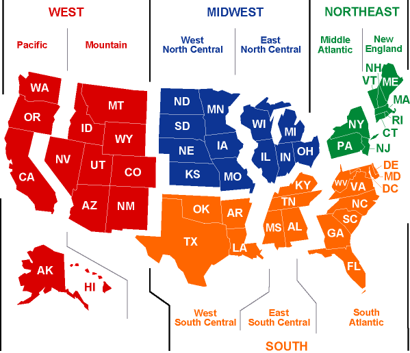
As you move from big to small market areas from State ? MSA(City) ? County ? Zip Code ? Neighborhood the statistical noise can increase depending on how many actual houses sold during the period (but not anywhere near the error rate in the coin flipping example above).

