Click Here To Grab Your FREE Account NOW!
For the last 18 months we’ve been locked-away in our lab developing FOUR game-changing new tools:
- Micro Market Ranking tool
- House Value Finder
- Cash Flow Finder
- Rent Growth Tracker
I believe we’re the only ones on Planet Earth to offer Property Value, Cash Flow and Rent Growth market analysis tools, and we overlay those findings with EACH micro market’s local real estate cycle.
… and we do it on a granular level in an easy-to-use 1-click format
covering virtually every County, Zip Code and Neighborhood in the country.
Today we’re previewing ONE small part of our new Micro Market Ranking tool… the COUNTY “Hot Market Scoring” map.
(If you’re not familiar with the Hot Market Score (our proprietary way to score the health of markets) and how it’s been making investors quite wealthy, click here to learn more.)
The map above ranks all COUNTIES in the U.S. based on their relative ‘Hot Market Score’ …as compared to all the other counties.
The RED, Orange and Yellow colors mean those counties scored in the TOP 10%, 20% or 30%, respectively, of all counties nationwide.
The PINK, Purple and Dark Blue colors mean those counties scored in the BOTTOM 10%, 20% or 30%, respectively.
With these new micro market tools, you can also drill INSIDE each county, down to the ZIP CODE and even the NEIGHBORHOOD levels!
Let’s enlarge the map, take a closer look at the COUNTIES in and around North Carolina.
As you can see, some large areas in Virginia are very weak (Pink & Purple colors) while North Carolina has both strong (Red, Orange and Yellow colors) AND weak regions.
These COUNTY level maps allow you to:
Target ONLY the Lowest Risk,
Highest Return Markets
It’s as easy as those ‘paint by number’ kits.
For example, in the map above, let’s look at the Raleigh-Durham area, which encompasses both Wake and Durham counties.
Both counties are RED; scoring in the top 10% nationwide. The purple counties to the east are considerably weaker. That’s NOT where you want to commit your time, effort and capital.
…and it works exactly the same when you drill even DEEPER into a market.
Let’s look INSIDE these county markets for the best (and worst) micro-market areas to invest, staring with the Raleigh Zip Code map.
At the zip code level, you see some stark differences within the same general market area; zones where you want to invest, and even more areas you want to avoid.
As a real estate Flipper or Wholesaler, using these zip code maps can create a huge competitive advantage when it comes to:
Slashing Your Lead Cost 67%
Finding MORE Deals with LESS effort
Knowing How to PRICE Your Offers
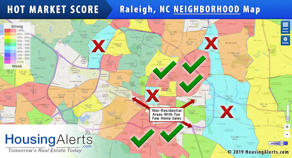
Drilling down INSIDE the Zip Codes – analyzing markets at the NEIGHBORHOOD level – reveals more precise micro market targeting opportunities. By knowing WHERE to focus your acquisition efforts, you stack the cards in your favor and have a huge competitive advantage before you even leave the starting gate.
By way of example, the green checkmarks are the preferred micro markets to target your real estate investing activities; the red ‘X’s are not!
The Micro Market Ranking tool AND the micro maps you see above, are (currently) included at no additional cost with every PRO account.
YOUR real estate success is a function of knowing where to employ your time, talent and capital for the highest returns and the lowest risk and effort.
Did you know that you can grab a PRO account for about $16/mo when you choose an annual account for your local market?
With HousingAlerts, you’ll never invest blindfolded again! Check it out here to become a complete master of your market, today!
We have been rolling out some amazing new micro market tools for Wholesalers and Rehabbers. Our Neighborhood Ranking tool alone should save you thousands a month in targeted acquisition and lead generation costs. Click here to buy now.


